Designing Local Infra in Code
…or why the last 20% of software development is still 80% of the work.
It’s interesting how much the process of building software has changed compared with the old model, where the designer more or less invents every screen up front and a better or worse programmed version follows after a bit of iteration. In this case, it ended up pixel-perfectly the way I wanted it — after 86 iterations, to be exact.
I already wrote about my infrastructure setup earlier. Here I want to talk about the design process. Once the basic idea was in place, this is roughly where I landed after the first prompt:
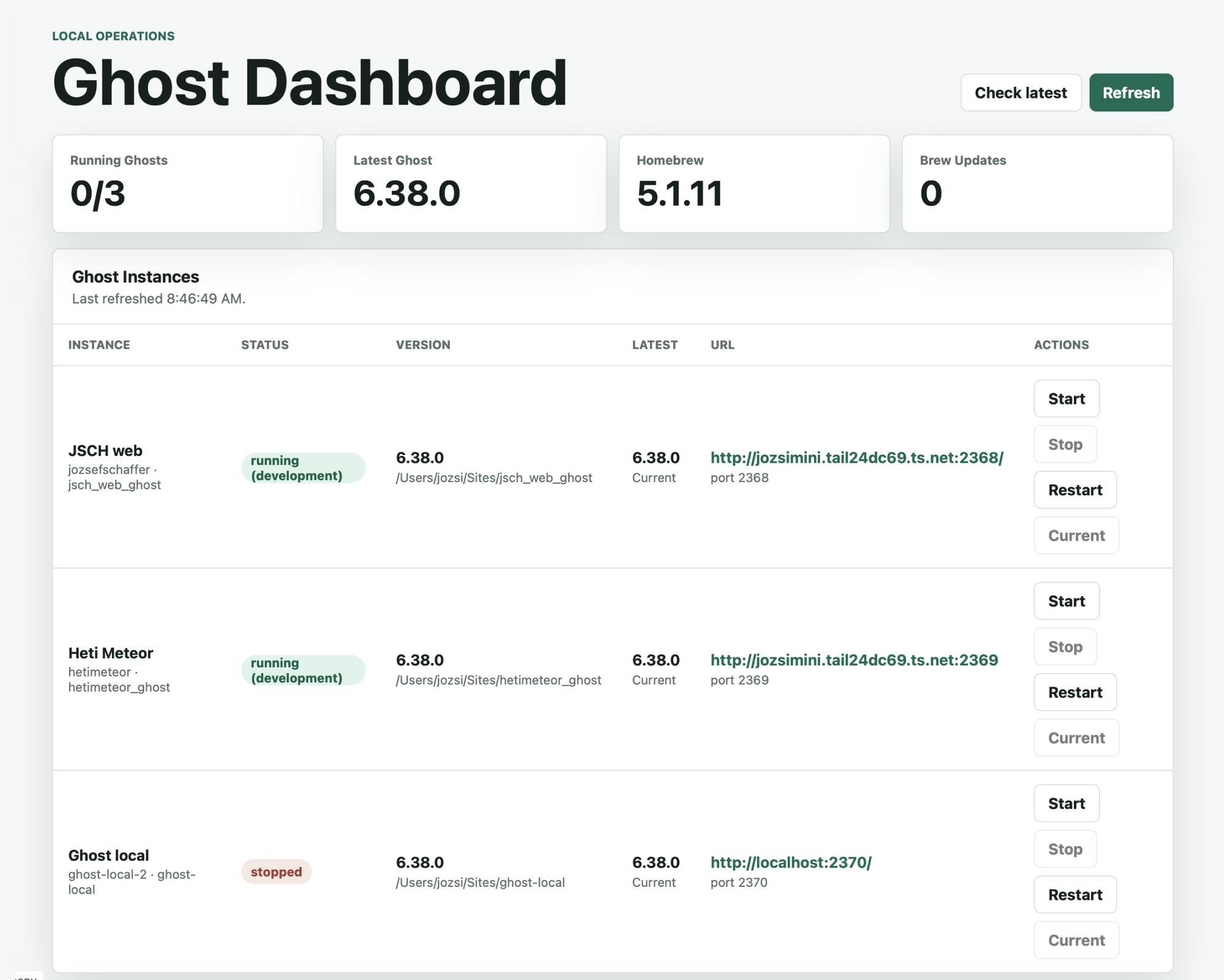
Technically this was fine, in a sense, but I immediately saw a whole list of problems. For one, this was no longer just a Ghost dashboard. If Brew is sitting right next to it, what are those “Current” buttons doing on the edges, and so on?
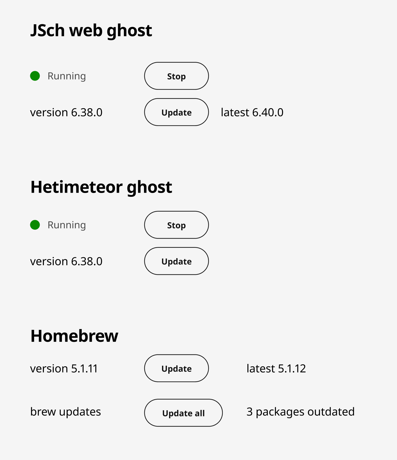
I had a quick idea and sketched it out in Figma on the default gray background:
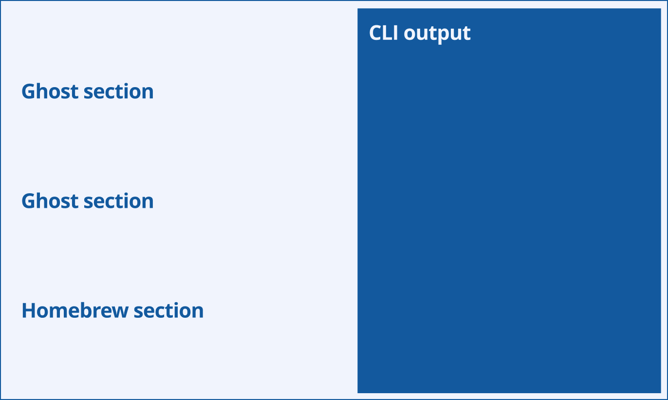
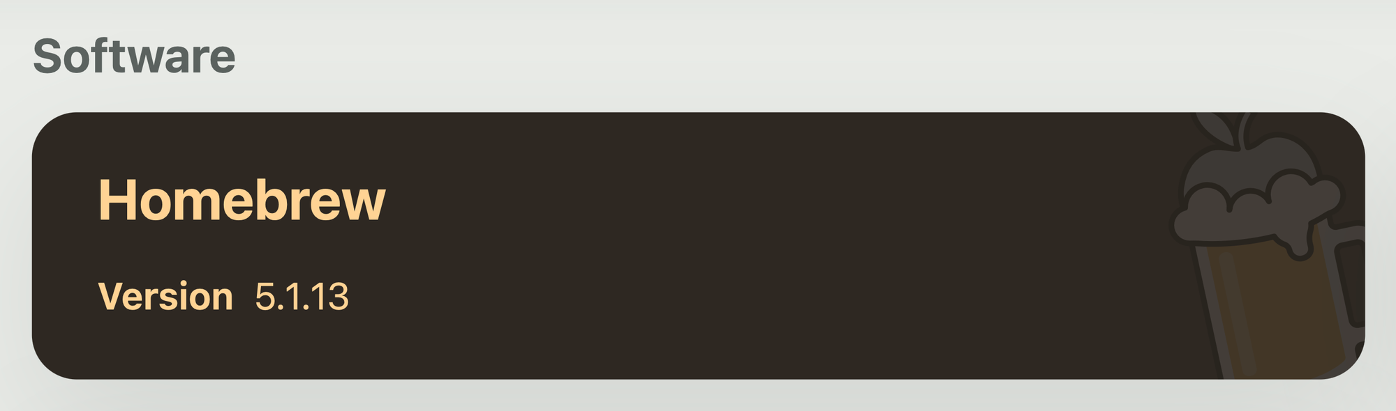
I did not want much more than this. I just wanted to see what lived where. I also knew I wanted to see the output of the commands, so I made a rough high-level concept for how the Terminal section might look:
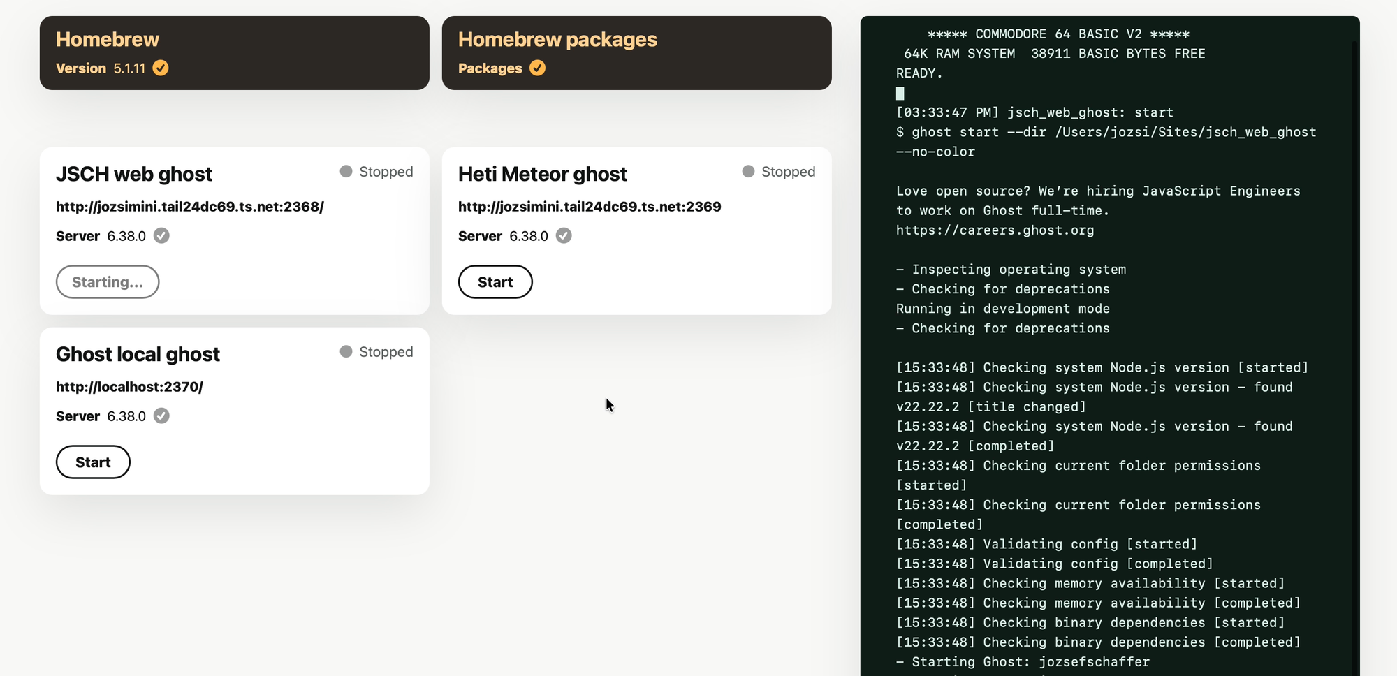
After burning through a couple more rounds of tokens, I got to a pretty good result:
The little check marks showed that a given thing was up to date, but I quickly realized that sprinkling check marks next to every row was completely unnecessary. Information should only appear when it is interesting or needs attention. If something is already up to date, that should be the default state; it does not need special emphasis. So the check marks went into the bin.
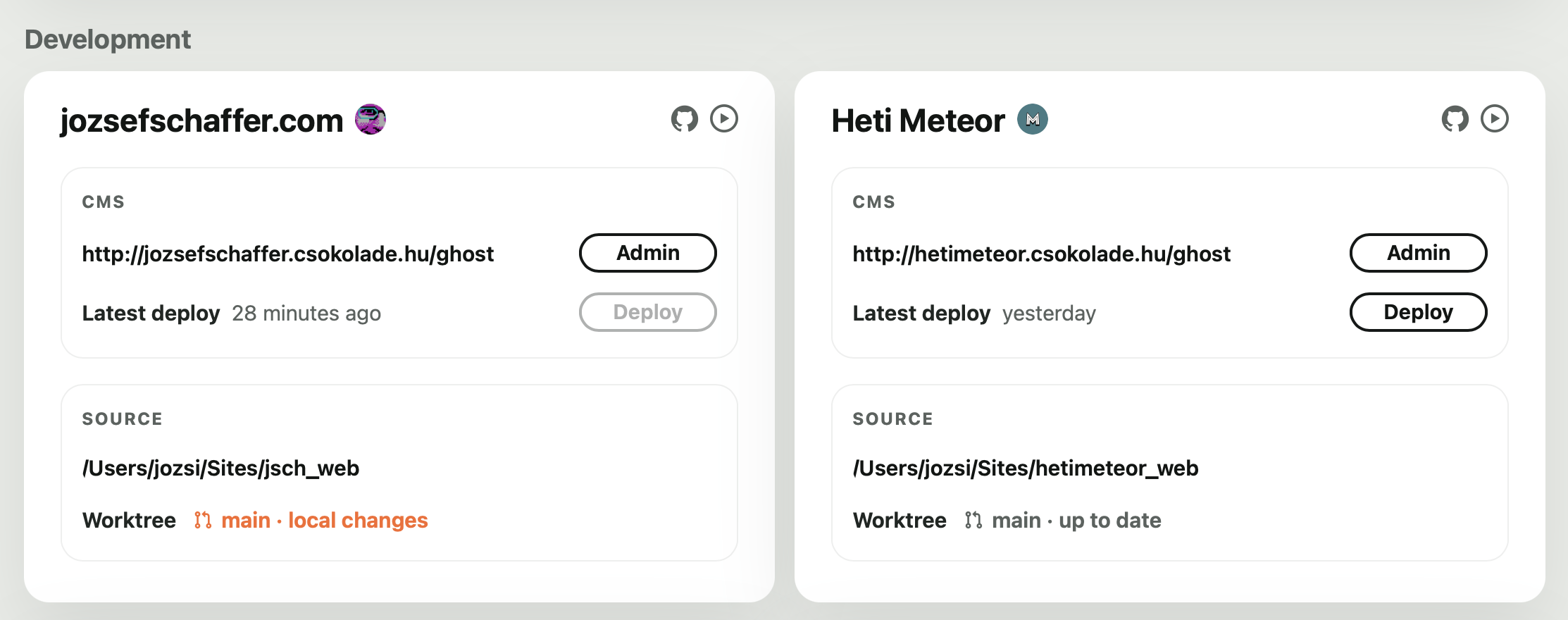
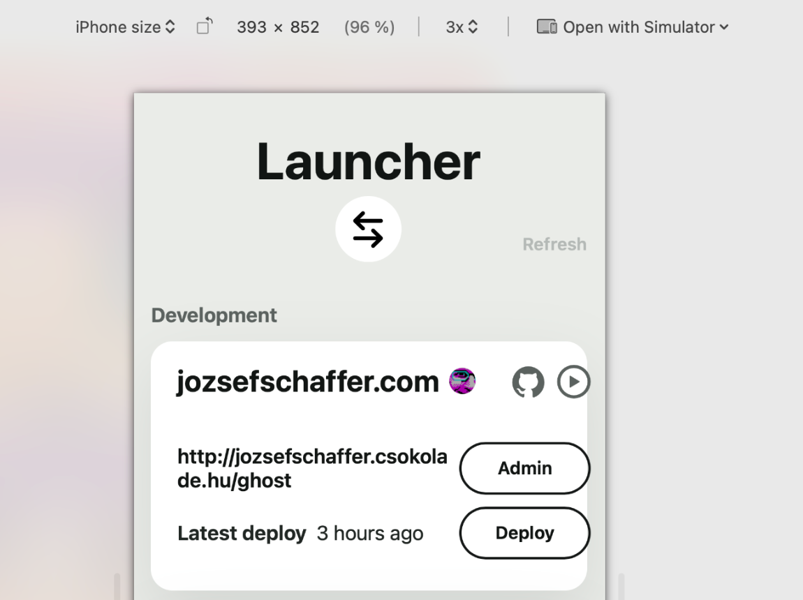
At about this point, I decided I was going to cram my development projects into this page as well:
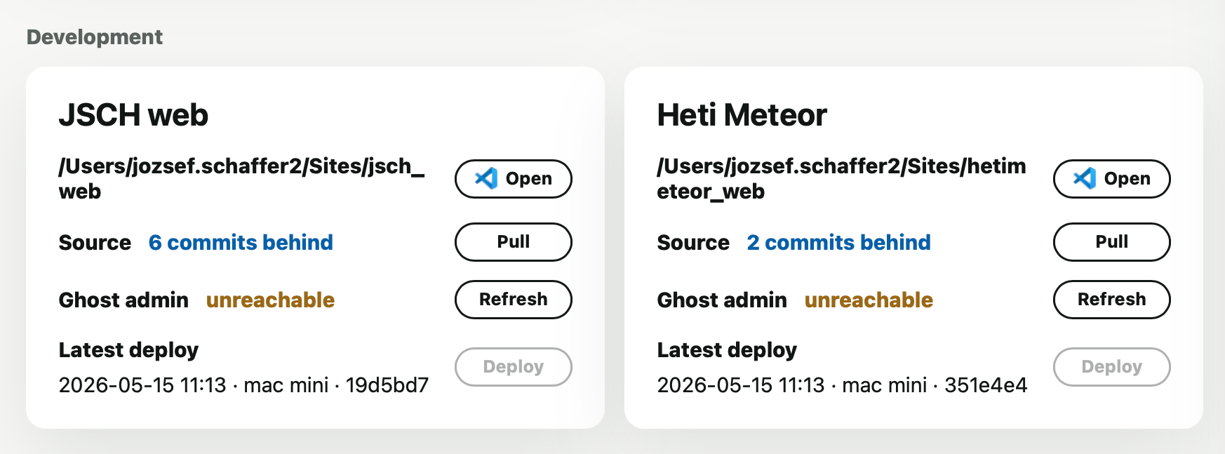
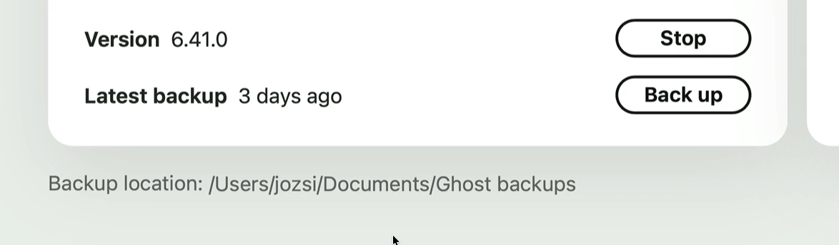
Here you can see that relative dates were not there yet, and whether Ghost was reachable sat on its own row with a dedicated “Refresh” button. It was a perfectly reasonable design decision at the time, but I ended up applying the same principle everywhere else: less is more. I removed the whole row and now only show a tiny icon when the Ghost server is unavailable.
The other thing I was very deliberate about: an “Open in VSC” button is nice, sure, but it is still another button sitting in the UI. And if I also wanted an “Open in Terminal” button, did that really mean yet another button in the same row?
I decided to create a completely separate component that only appears when you actually move the mouse close to it. But then came the next question: how do you show two buttons at once in such a small space? My eventual idea was to make the hover state itself contain the two actions, so you choose them right there:
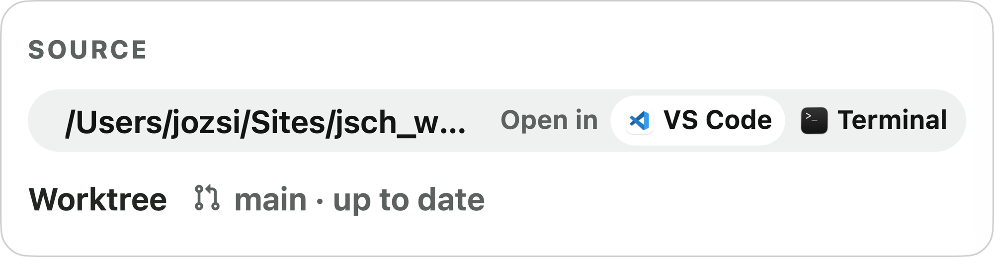
The icons were dug out of app bundles, GitHub, and elsewhere, and even the little white highlight inside the Terminal icon lines up pixel-perfectly with the rounding of the component that contains it. These are the things nobody consciously notices, but everyone notices when they are off.

I had done this kind of fine-tuning before, but only in Figma. I would have built this button exactly the same way, with exactly the same energy, in that parallel universe. What changed here was that the Figma step disappeared entirely. I knew exactly what I wanted to achieve in that specific UI context, so all that remained was to keep turning the screws until it clicked — in code, in the product, in the final result.
This kind of pixel-polishing almost never happens with other people involved, or only very rarely. In the old world, you would make something like this the exact same way, and then someone would usually come back with: could this maybe be a little simpler to build? Sure. Of course. Sigh.
That said, I should be precise: you can almost never foresee details like this in advance. If I had been forced to hand over a Figma file for this dashboard up front, this solution would never have occurred to me. You only learn what is better through use.
This component also has another state where it contains only a single action. The animation is identical in both:
Back to the dashboard itself. The bigger problem was that after a while it was hard to tell what belonged with what: there were servers, locally running services and package managers, and development projects. And then there was the device question too: what happens when I use it from a phone? What happens on a laptop?
I concluded that I needed two pages: one where I only see the local services, and another for the development cards. But then how do I switch between them?
In the very first version there was just a plain link next to the page title. You clicked that to switch. It worked, but it did not feel especially inviting. After some back and forth, I designed a “switcher” icon in Figma and exported it as an SVG while keeping the IDs intact, which meant I could animate it from code as well:
The mobile experience
I also had to make a mobile version of the header, among other things. My first idea was to center the action button, but I quickly realized it really needed to sit on the right. This is another detail that only reveals itself in use. I iterated on the mobile viewport a lot before it felt truly good — but nobody cares.
I also made a lot of custom tweaks for mobile, including the command-line output. At first it was just a container at the bottom of the content area, which meant I had to scroll down every time I pressed a button that produced output. Then I had the idea to create a mobile-only terminal output screen. Here is the full mobile experience in action on an actual device:
The floating “Refresh” and “Terminal” toggle buttons are custom to the mobile view too.
Closing thoughts
Overall, what I keep coming back to is that there is still no better design process for software than letting code and UI evolve hand in hand, in the shortest iterations possible. Software development itself has not changed: it is still the same endless cycle of polishing, testing, and trying things that it has always been.
As a designer, I was very rarely given the chance to iterate this much and try this many ideas directly in the built product. Usually all of that happened in the parallel Figma universe: a lot of largely pointless, mostly self-indulgent visual fiddling.
I burned a long weekend and a good few evenings on this, but every morning I look at it with real satisfaction. It feels really – damn – good.