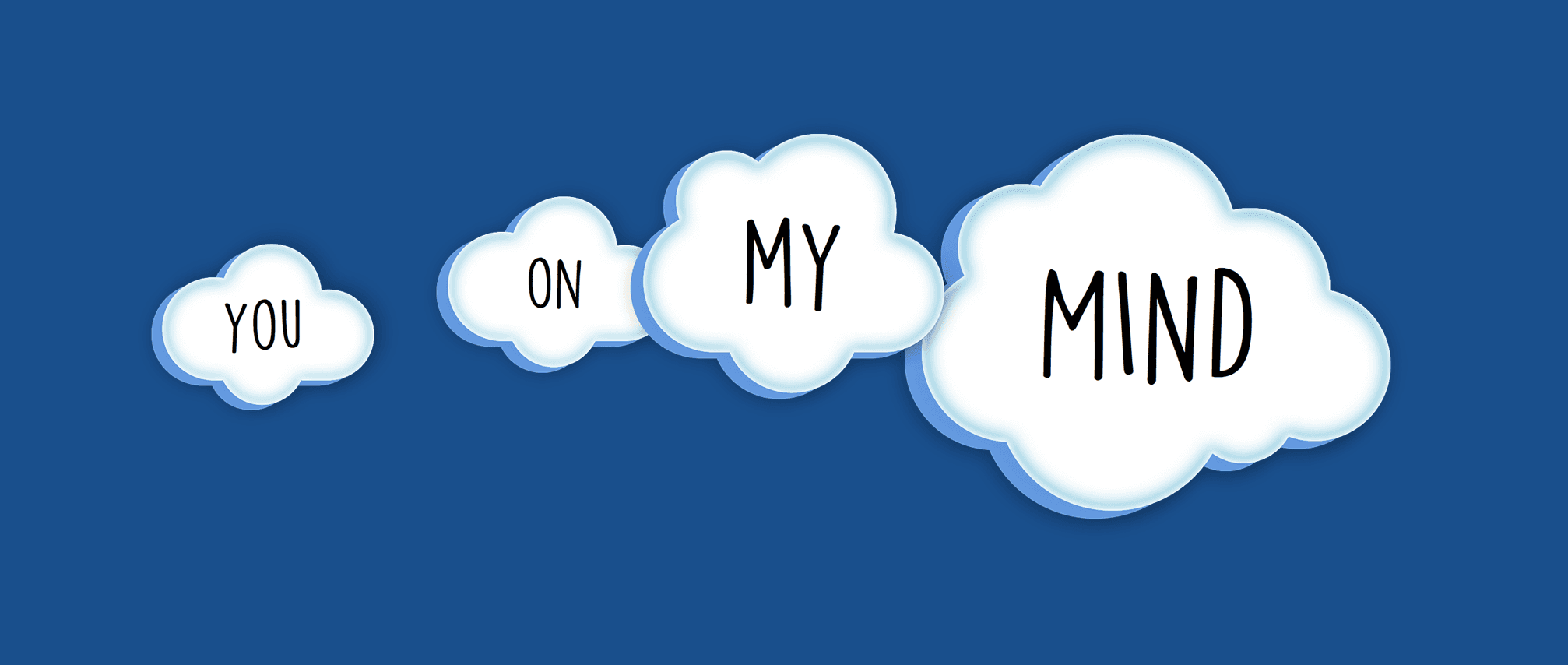
Back in 2015, over the course of two years, a friend of mine and I lifted an idea off the ground, made it into a digital product, and released it on iOS and Android.


Aside from designing user journey and interactions I was busy managing many things: branding, front-end for two platforms, website, engineering, and product.

The pitch

Sometimes you just want to let someone know that you're thinking about them. Without words, sounds, emojis, or heartbeats.


Your phone gets a notification from a person you know. This notification is alive for as long as the caller keeps a finger on the screen. You're on this persons mind.


You also can hop in to that moment by tapping the screen and performing a simultaneous digital event.

Illustrations by Dávid Kozma

Girl you know from school? Spouse? Having a complicated dentist procedure and need support? There are quite a few use cases where it makes sense to just send a Yomm instead of trying to communicate with words or emojis.

A simple app

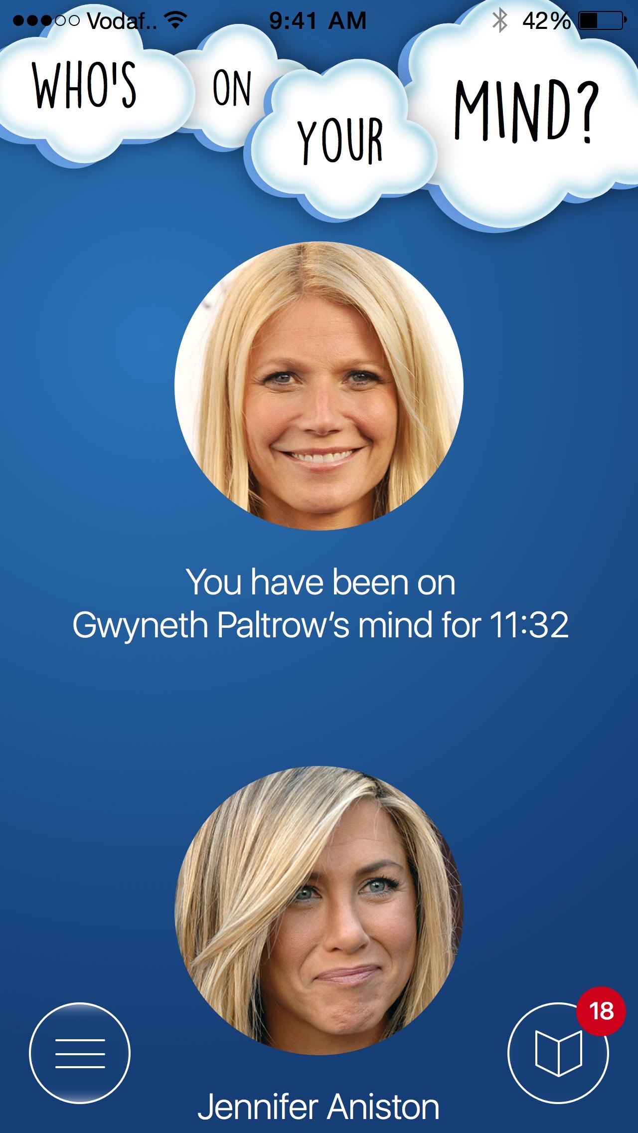
From the outside the user journey doesn't seem much: you see your contact list, front and center, you select a person and then initiate a yomm session.


Let's build.
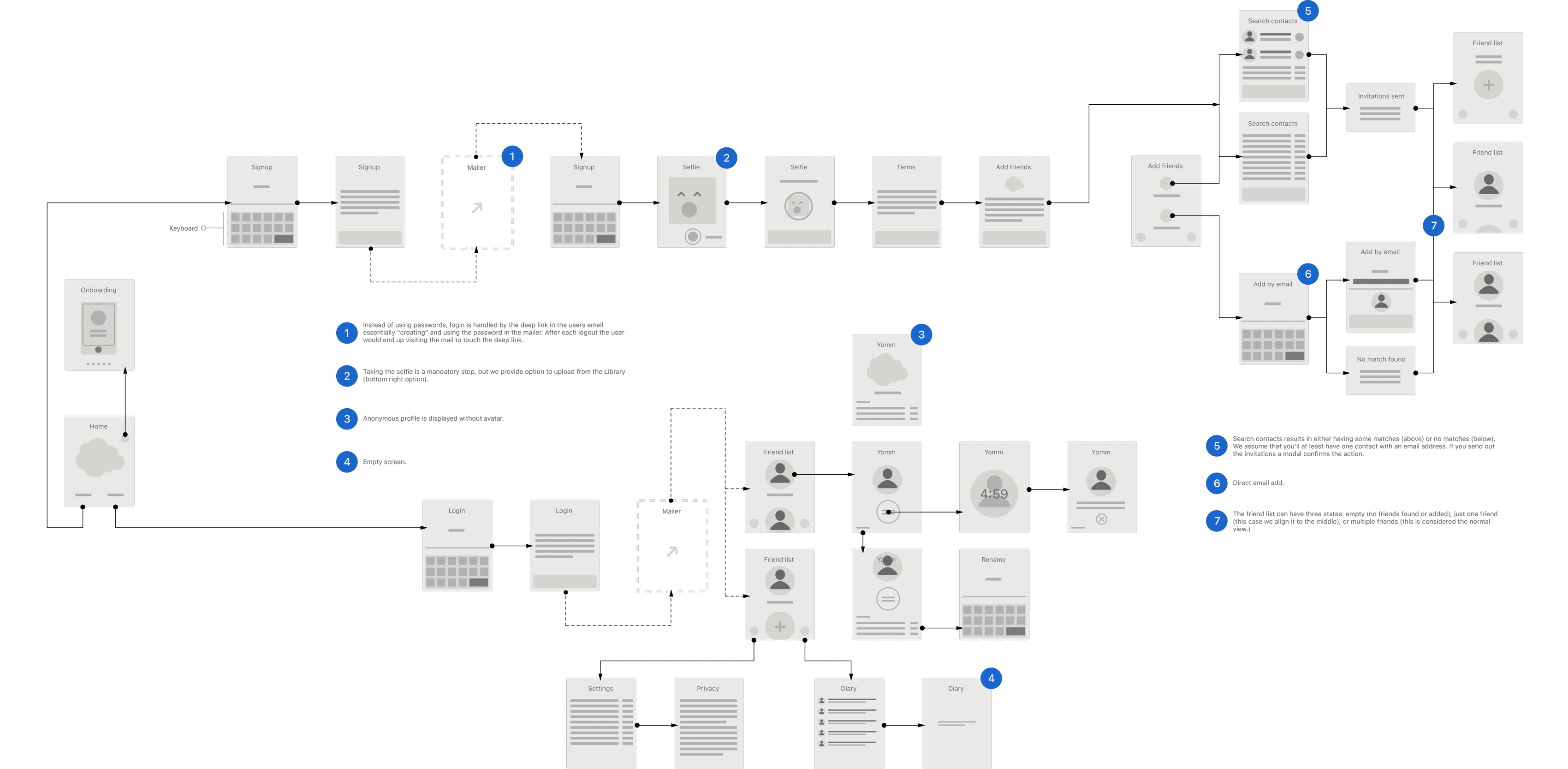
Even just drawing out the basic flow we realized a simple idea will be daunting to execute. (It was indeed.)
Along the way we'd faced millions of product questions:


What if you tap the avatar by accident on the list?

How can you add friends?

Can you remove someone? Block?

Can you yomm someone anonymously?

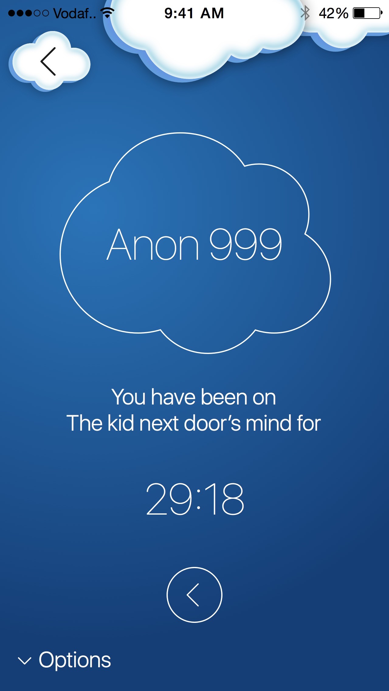
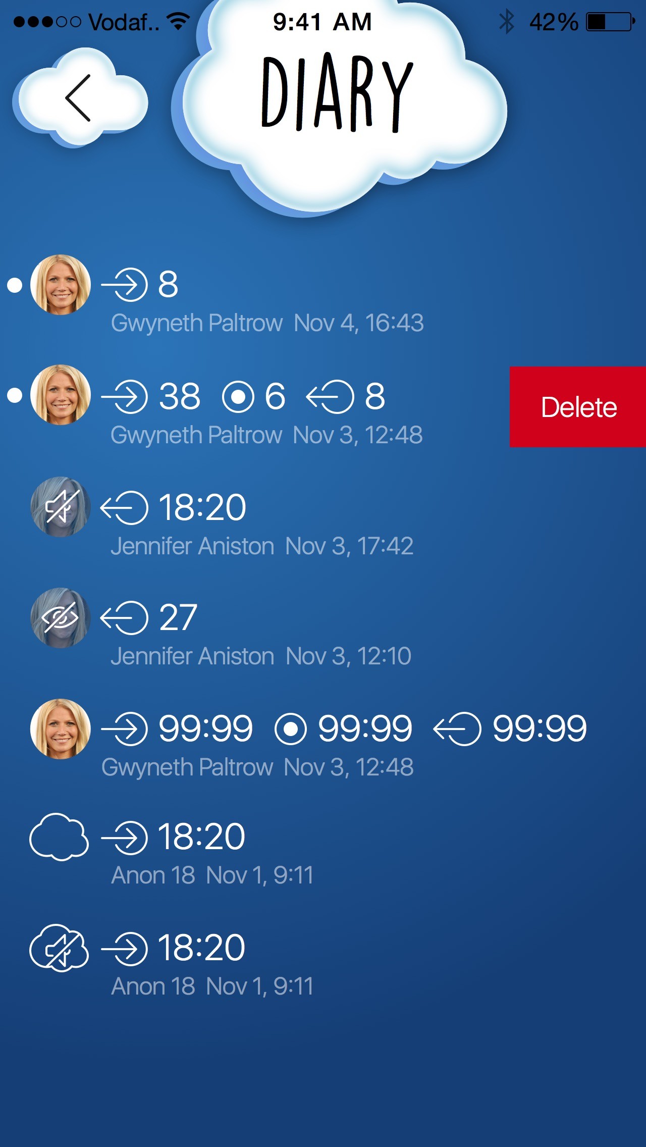
Do you want to know who you called and how long for?

What is the yomm session experience like?

What if you have the app open and receive a notification?

You and me

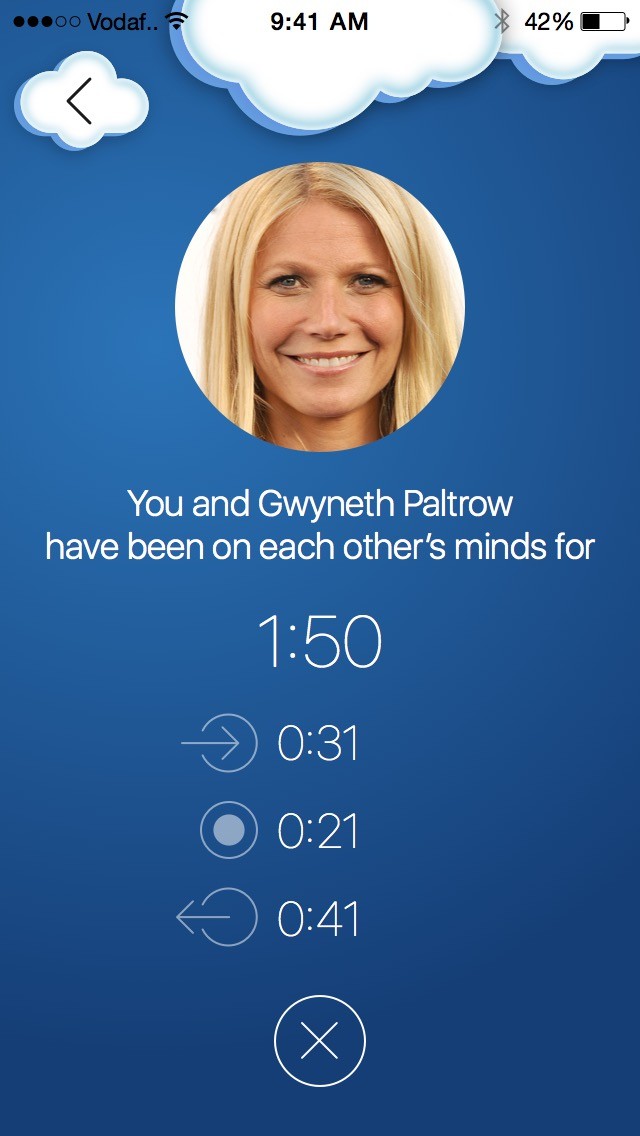
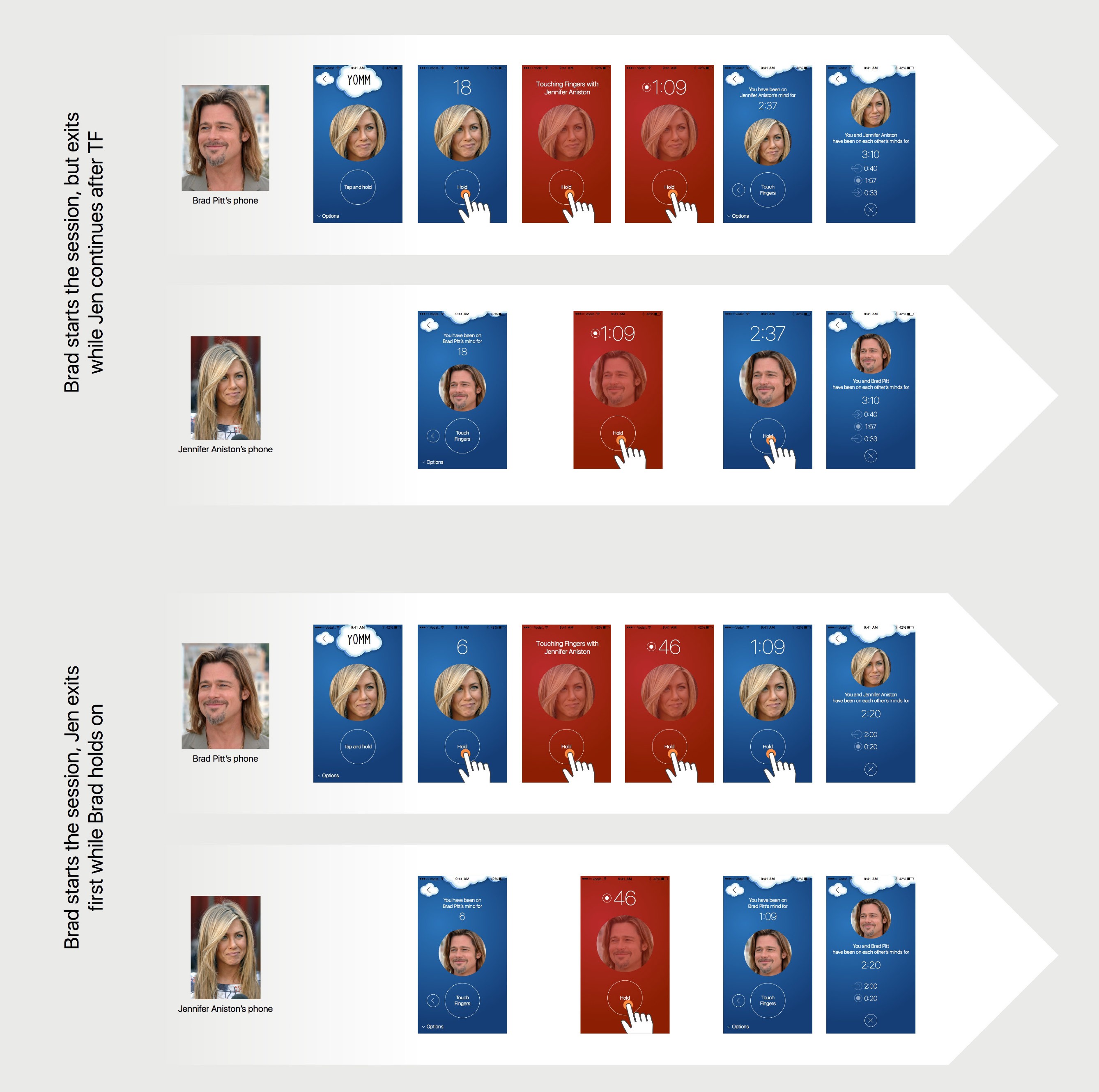
Another great display of a first release product decision: do you need the ability to simultaneously join a session? How about either leaving the session while the other keeping it alive?


The premise feels great: you have a different experience when you're "touching fingers".


We thought it was an essential feature, so we made an attempt to include it. The following illustration describes how might two person perform a "complex" session by taking it over from the other:

Is this a requirement for a first release, or just nice to have?

Testing it

I tested the app with family and friends to see if they understand it or know what to do.


I didn't use any scientific method for testing it: I always had a build on my phone and whenever there was a chance, I showed it. It was surprising how even the simplest things can puzzle people using it.


Everything that we invented was not working the way it should have. Patterns established by iOS were fine, but new interactions were not. Those required refinement over refinement.

Learnings

I only can speak for myself when I say I made all the mistakes the startup literature already had written:


  • simultaneous release both on iOS and Android when the user base is non existent

  • instead of gradually building the user base, focusing on a Big Bang Release, waiting for the effect (in reality this rarely happens this way)

  • product decisions when it comes to an MVP: what we need now and what can we do later

  • design and interaction details: what is worth spending time on, what is not

  • falling in love with an idea and being emotional about it

  • being afraid of mentioning the app idea for friends fearing it will be stolen

  • there are usually more opportunities to simplify the product


The app made it into the hands of users, but it had failed to gain traction and we eventually decided to close it down. 😢
(In my life it still makes for a great idea and story.)

(In my life it still makes for a great idea and story.)

Further ideas

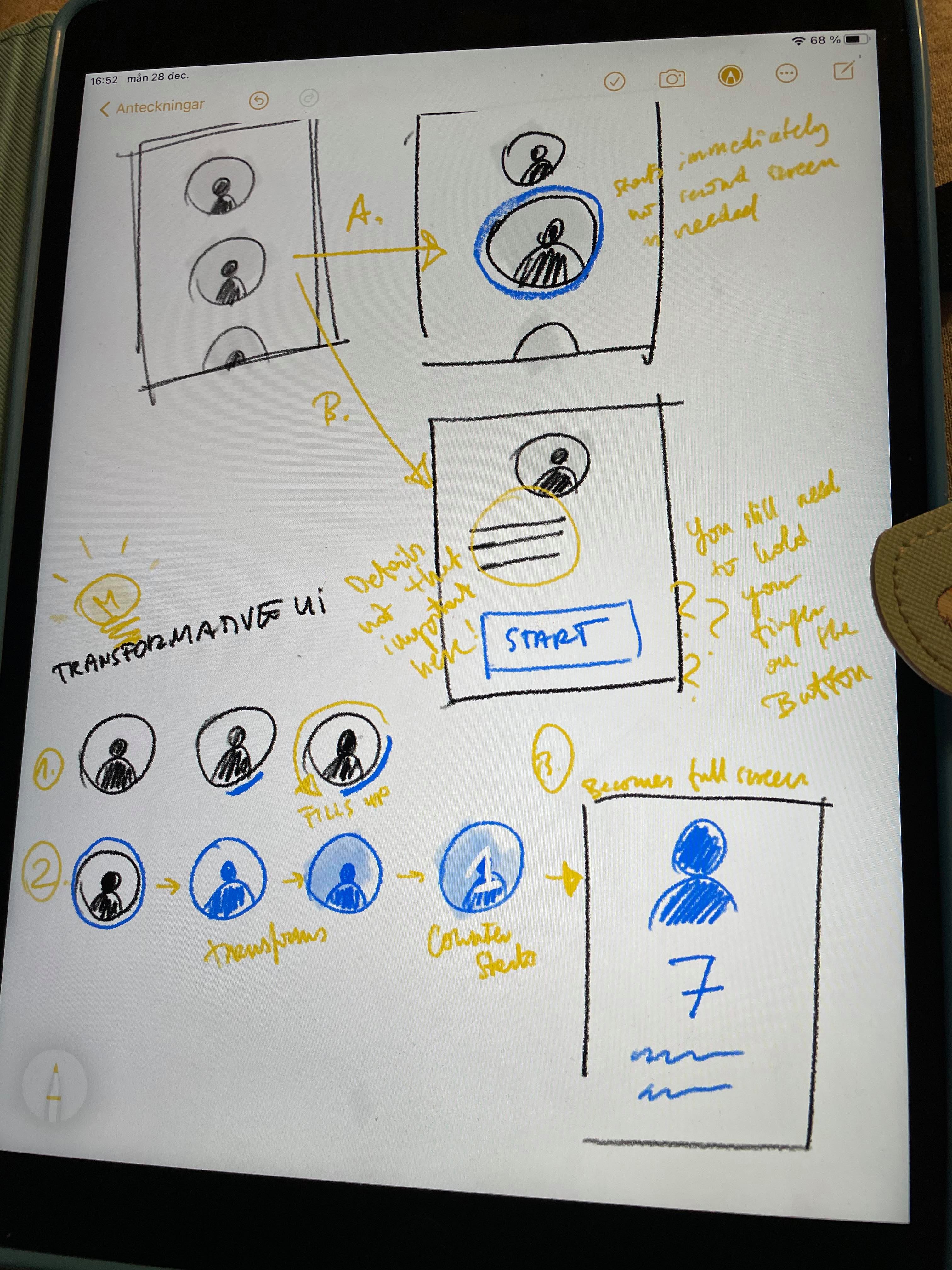
There was one thing I started to think about long after: what if we didn't have a second screen with the active button and you could initiate the session right from the main screen? What if it was a "transformative UI" which would then transform into the session? I started to explore this idea: